

Create your dataviz theme
In our exploration of CSS, we've discovered its power in tailoring the final report to reflect our individual taste and personal branding.
To add a final touch of polish, we can also create a custom theme for ggplot2, ensuring consistency and alignment with our desired aesthetic across all charts!
The theme() function
In the realm of R, ggplot2 has become the go-to tool for crafting charts. Its signature default style, characterized by a grey background adorned with grids, is renowned and instantly recognizable.
Check the exhaustive list of options of the theme() function.
Thankfully, ggplot2 provides a versatile theme() function that empowers users to tailor their visualizations to their exact specifications.
Let's illustrate this with a simple example: a scatterplot featuring a striking green title.
library(ggplot2)

ggplot(mtcars, aes(x = mpg, y = wt)) +
geom_point() +
labs(title = "Customized Scatterplot", x = "Miles Per Gallon", y = "Weight") +

theme(
plot.title = element_text(color = "#69b3a2", size = 14, face = "bold"),
plot.margin = margin(3, 3, 3, 3, "cm")
)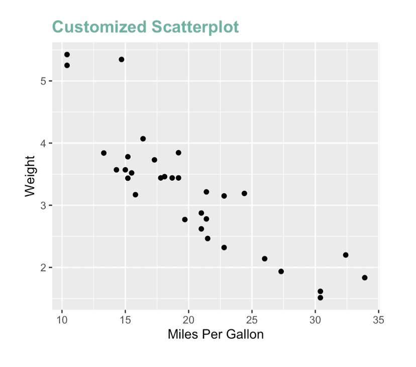
A ggplot2 chart with a personalized title, made thanks to the theme() function
A set of predefined theme
Customizing a theme can feel overwhelming, with numerous options available to tweak and adjust.
However, a plethora of predefined themes exist, ready to be utilized in a matter of seconds!
This lesson is for members only! 😔
Become a member now to access the full course with a lifetime access!
Or Login